Happy Friday everyone!
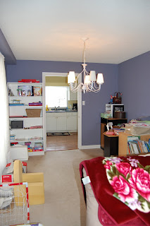
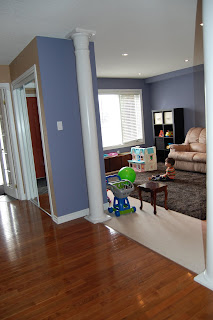
Here are a couple before pictures of the formal living and dining room (with previous owner's stuff):


We chose not to use the space that way because we want the kids to have their own area to play.
So we have concentrated on making it a functional space that we can use to do things we love.
That means the kids can play in a safe area where I am not worried about the "stuff" in the room.
It is more about practicality in this case.
In this picture, you can see the light fixture which Robin is going to change out for something cheap and close to the ceiling. Right now you can see my messy craft desk and storage bookshelf for the kids crafts and puzzles. Also, you get a sneak peak of the kitchen beyond. :)
We painted this room. I wanted more of a blue colour, but since we chose the colours online, we ended up with more of a purple, and although it is a bit non-traditional, I still think it is kind of pretty.
 Here you can see that this is the first area which greets you after the foyer (which is to the left). Also, we are very excited to have a front window (which was lacking in our old house). I am going to dress this window with white curtains from Ikea.
 This is the entryway to the room, flanked by two white pillars.. I need some kind of art or picture above the sofa, but haven't found anything yet.
Here is a view of the potlights which Robin installed (there are 6), and the kids toys and the tv.
We put a very soft area rug down (the kids "live" on the floor). It will also help protect the white carpet a bit (I hope).


1 comment:
Wow! Looks great!
Post a Comment